Tips for making plots
A walk through on how I make plots.


- About
- A Line Plot
- A twin axis line plot
- A bar plot
- A density plot
- A 2-D image or spectrogram plot
- A confusion matrix
- Adding plot into a paper
- Adding plot into a slide or webpage
- That's it!
About
This python notebook is a demonstration of some simple codes to make neat plots. I have used these to make plots for my research papers. Some of my friends liked them so I thought to share some tips in this post. I will keep it short and to the point. Also, there are lots of amazing tutorials in the web to make wonderful plots with python. So, don't just stop here if you dont find what you are looking for.
import numpy as np
import matplotlib.pyplot as plt
mean, std = 0, 1
num_samples = 1000
y = np.random.normal(mean, std, size=num_samples)
plt.plot(y)
plt.show()

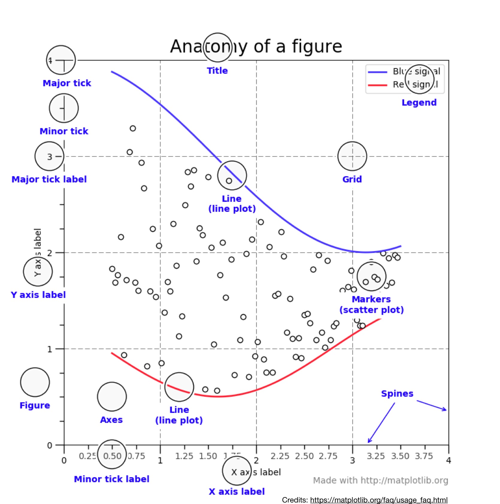
On staring the above plot for a minute you will easily spot several things which can be improved. The key is to know the terminology associated with the anatomy of a matplotlib plot. Once you know the terms, a simple searching on internet will help you how to incorporate anything you wish into this plot. So, here is the anotomy.
Let's improve the plot now.
# we import one more package to make minor ticks
from matplotlib.ticker import (MultipleLocator, FormatStrFormatter,
                               AutoMinorLocator)

fig = plt.subplots(figsize=(16,5)) # (width_in_cms, height_in_cms)
# plotting without any care
ax = plt.subplot(1,2,1)
ax.plot(y)

# plotting wiith some care
ax = plt.subplot(1,2,2)
ax.plot(y)
ax.set_xlabel('SAMPLE INDEX',fontsize=14)
ax.set_ylabel('A.U.',fontsize=14) # A.U stands for Arbitrary Units
ax.grid(True)
ax.spines['right'].set_visible(False)
ax.spines['top'].set_visible(False)
ax.xaxis.set_minor_locator(AutoMinorLocator())
ax.yaxis.set_minor_locator(AutoMinorLocator())
ax.tick_params(which='both', width=2)
ax.tick_params(which='major', length=7)
ax.tick_params(which='minor', length=4, color='gray')
plt.xticks(fontsize=13)
plt.yticks(fontsize=13)
plt.show()

# Create sin and cosine
fs = 1000
t = np.arange(0,8000,1)/fs
y1 = np.sin(t)
y2 = np.cos(t)

fig, ax1 = plt.subplots(figsize=(9,4))
color = 'tab:red'
ax1.set_xlabel('TIME [in secs]')
ax1.set_ylabel('sin(t)', color=color, fontsize=14)
ax1.plot(t,y1, color=color,alpha=0.7) # alpha controls the opacity
ax1.tick_params(axis='y', labelcolor=color)
ax1.spines['top'].set_visible(False)
ax1.grid(True)
ax1.xaxis.set_minor_locator(AutoMinorLocator())
ax1.yaxis.set_minor_locator(AutoMinorLocator())
ax1.tick_params(which='both', width=2)
ax1.tick_params(which='major', length=7)
ax1.tick_params(which='minor', length=4, color='gray')
plt.xticks(fontsize=13)
plt.yticks(fontsize=13)
# plt.xticks([0,31,60,91,len(sorteddates)-1],\
#            ['11 Jan','11 Feb','11 Mar','11 Apr','16 May 2020'],rotation=0)

ax2 = ax1.twinx()  # instantiate a second axes that shares the same x-axis

color = 'tab:blue'
ax2.set_ylabel('cos(t)', color=color,fontsize=14)  # we already handled the x-label with ax1
ax2.plot(t,y2,color=color,alpha=0.5)
ax2.tick_params(axis='y', labelcolor=color)
ax2.spines['top'].set_visible(False)
ax1.grid(True)
ax2.xaxis.set_minor_locator(AutoMinorLocator())
ax2.yaxis.set_minor_locator(AutoMinorLocator())
ax2.tick_params(which='both', width=2)
ax2.tick_params(which='major', length=7)
ax2.tick_params(which='minor', length=4, color='gray')
plt.xticks(fontsize=13)
plt.yticks(fontsize=13)
# plt.xticks([0,31,60,91,len(sorteddates)-1],\
#            ['11 Jan','11 Feb','11 Mar','11 Apr','16 May 2020'],rotation=0)
fig.tight_layout()  # otherwise the right y-label is slightly clipped
plt.show()

# First we will define a function to show significance values.
# I pulled this from internet some time back and now can't find the reference. If you find do find it, let me know, I will like to add an acknowledgement.
# funcs definitions to make significant plot markers
def barplot_annotate_brackets(num1, num2, data, center, height, yerr=None, dh=.05, barh=.05, hdist=1,fs=None, maxasterix=None,fsize=14):
    """
    Annotate barplot with p-values.

    :param num1: number of left bar to put bracket over
    :param num2: number of right bar to put bracket over
    :param data: string to write or number for generating asterixes
    :param center: centers of all bars (like plt.bar() input)
    :param height: heights of all bars (like plt.bar() input)
    :param yerr: yerrs of all bars (like plt.bar() input)
    :param dh: height offset over bar / bar + yerr in axes coordinates (0 to 1)
    :param barh: bar height in axes coordinates (0 to 1)
    :param fs: font size
    :param maxasterix: maximum number of asterixes to write (for very small p-values)
    """

    if type(data) is str:
        text = data
    else:
        # * is p < 0.05
        # ** is p < 0.005
        # *** is p < 0.0005
        # etc.
        text = ''
        p = .05

        while data < p:
            text += '*'
            p /= 10.

            if maxasterix and len(text) == maxasterix:
                break

        if len(text) == 0:
            text = 'n. s.'

    lx, ly = center[num1], height[num1]
    rx, ry = center[num2], height[num2]

    if yerr:
        ly += yerr[num1]
        ry += yerr[num2]

    ax_y0, ax_y1 = plt.gca().get_ylim()
    dh *= (ax_y1 - ax_y0)
    barh *= (ax_y1 - ax_y0)

    y = max(ly, ry) + dh

    barx = [lx, lx, rx, rx]
    bary = [y, y+barh, y+barh, y]
    mid = ((lx+rx)/2, y+barh+hdist)

    plt.plot(barx, bary, c='black')

    kwargs = dict(ha='center', va='bottom')
    if fs is not None:
        kwargs['fontsize'] = fs

    plt.text(*mid, text, **kwargs,fontsize=fsize)
Now we will make the bar plot.
# make data
x = []
x.append(np.random.normal(10, std, size=num_samples))
x.append(5+x[0])
# scatter plots
fig = plt.subplots(figsize=(9, 4))

ax = plt.subplot(1,2,1)
ax.scatter(x[0],x[1],color='green')
ax.set_xlabel('VAR 1',fontsize=14)
ax.set_ylabel('VAR 2',fontsize=14)
ax.xaxis.set_minor_locator(AutoMinorLocator())
ax.yaxis.set_minor_locator(AutoMinorLocator())
ax.tick_params(which='both', width=2)
ax.set_xlim(5,20)
ax.set_ylim(5,20)
ax.grid(True)
plt.xticks(fontsize=13)
plt.yticks(fontsize=13)
ax.spines['right'].set_visible(False)
ax.spines['top'].set_visible(False)
# ax.plot([5,60],[5,60],'--',color='black',alpha=0.25)
ax.tick_params(which='minor', length=4, color='gray')


ax = plt.subplot(1,2,2)
ax.bar(2,np.mean(x[0]),yerr=np.std(x[0]), align='center',alpha=1, ecolor='black',capsize=5,hatch="\\\\",color='red',label='VAR 1',width=.5)
ax.bar(4,np.mean(x[1]),yerr=np.std(x[1]), align='center',alpha=1, ecolor='black',capsize=5,hatch="//",color='blue',label='VAR 2',width=.5)
ax.set_ylabel('AVERAGE',fontsize=14)
ax.legend(loc='upper right',frameon=False,fontsize=14)
plt.xticks([2,4], ['VAR 1','VAR 2'],rotation=0)
ax.set_xlim(1,7)
ax.set_ylim(5,19)
plt.xticks(fontsize=13)
plt.yticks(fontsize=13)
ax.grid(True)
ax.spines['right'].set_visible(False)
ax.spines['top'].set_visible(False)
# sns.despine()
# Call the function
barplot_annotate_brackets(0, 1, 'p = dummy', [2,4],[np.mean(x[0]),np.mean(x[1])], dh=.1,barh=.05,fsize=14)
plt.tight_layout()
plt.show()

# here we will use the seaborn package
import seaborn as sns
sns.set() # Use seaborn's default style to make attractive graphs
sns.set_style("white")
sns.set_style("ticks")

fig = plt.subplots(figsize=(8,3))
ax = plt.subplot(1,1,1)
sns.distplot(x[0],label='VAR 1',color='red')
sns.distplot(x[1],label='VAR 2',color='blue')
# sns.kdeplot(np.reciprocal(rt_spkr_2[0]), shade=True,color='red',label='eng')
ax.grid(True)
ax.spines['right'].set_visible(False)
ax.spines['top'].set_visible(False)
ax.set_xlabel('A.U',fontsize=13)
ax.set_ylabel('DENSITY',fontsize=13)
ax.legend(loc='upper right',frameon=False,fontsize=13)
plt.xticks(fontsize=13)
plt.yticks(fontsize=13)
plt.show()

from scipy.io import wavfile # package to read WAV file
from mpl_toolkits.axes_grid1 import make_axes_locatable # to move placement of colorbar


# function to create spectrogram
def generate_spectrogram(x,fs,wdur=20e-3,hdur=5e-3):
    X = []
    i = 0
    cnt = 0
    win = np.hamming(wdur*fs)
    win = win - np.min(win)
    win = win/np.max(win)
    while i<(len(x)-int(wdur*fs)):
        X.append(np.multiply(win,x[i:(i+int(wdur*fs))]))
        i = i + int(hdur*fs)
        cnt= cnt+1
    X = np.array(X)
    Xs = abs(np.fft.rfft(X))
    return Xs

# read WAV file and plot data
[fs, x] = wavfile.read('./my_sounds/count.wav')
sig = x/np.max(np.abs(x))
taxis = np.arange(0,len(x))/fs
fig = plt.subplots(figsize=(6,1))
ax = plt.subplot(1,1,1)
ax.plot(taxis,sig)
ax.set_xlim(taxis[0]-0.1/2,taxis[-1])
ax.set_ylim(-1,1)
ax.set_xlabel('TIME [in s]')
ax.set_ylabel('A.U')
sns.despine(offset = .1,trim=False)
# fmt='png'
# plt.savefig(path_store_figure+'IIScConnect_sample_count_sig.'+fmt, dpi=None, facecolor='w', edgecolor='w',
#     orientation='portrait', papertype=None, format=fmt,transparent=False, bbox_inches='tight', pad_inches=None, metadata=None)
plt.show()

fig, ax = plt.subplots(figsize=(6,4))
Xs = generate_spectrogram(sig,fs,wdur=25e-3,hdur=2.5e-3)
XdB = 20*np.log10(Xs.T)
XdB = XdB - np.max(XdB)
im = ax.imshow(XdB,origin='lower',aspect='auto',extent = [taxis[0], taxis[-1], 0, fs/2/1e3],
               cmap='RdBu_r',vmin = 0, vmax =-100)
divider = make_axes_locatable(ax)
colorbar_ax = fig.add_axes([.95, 0.1, 0.015, 0.5])
fig.colorbar(im, cax=colorbar_ax)
ax.set_xlim(taxis[0]-0.1/2,taxis[-1])
ax.set_ylim(-.1,4)
ax.set_xlabel('TIME [in s]')
ax.set_ylabel('FREQ [in kHz]')
sns.despine(offset = 0.01,trim=False)
# plt.savefig(path_store_figure+'IIScConnect_sample_count_spectgm.'+fmt, dpi=None, facecolor='w', edgecolor='w',
#     orientation='portrait', papertype=None, format=fmt,transparent=False, bbox_inches='tight', pad_inches=None, metadata=None)
plt.show()


cf_matrix = np.random.normal(0,1,(5,5))
keys = ['A','B','C','D','E']
fig = plt.subplots(figsize=(7,5))
ax = plt.subplot(1,1,1)
# sns.set(font_scale=1.4)#for label size
sns.heatmap(cf_matrix/np.sum(cf_matrix)*100, annot=True, fmt='.2g', cmap='Blues', annot_kws={"size": 13},\
           cbar_kws={'label': 'RANDOM NUMBERS'})# font size
ax.figure.axes[-1].yaxis.label.set_size(10) # fontsize for label on color bar
ax.set_xticks(np.arange(len(keys)))
ax.set_yticks(np.arange(len(keys)))
ax.set_xticklabels(keys,rotation=0,fontsize=13)
ax.set_yticklabels(keys,rotation=0,fontsize=13)
plt.show()

fig = plt.subplots(figsize=(6,4)) # (width_cms,height_cms)
You can also resize the figure in latex but that doesn't look very nice as the text and numbers inside the figure don't get appropriately scaled. From python, I save figure as PDF using:
ax.figure.savefig('name.pdf', bbox_inches='tight')
For more options, there is this:
fmt='pdf'
plt.savefig('name.'+fmt, dpi=None, facecolor='w', edgecolor='w',
    orientation='portrait', papertype=None, format=fmt,transparent=False, bbox_inches='tight', pad_inches=None, metadata=None)
Sometimes I have to create multiple subplots and also block diagrams. For this I open Keynote (in Mac), and insert the plots (and make any block diagrams) in a slide. Then I export the slide as a PDF (saving in Best form). Subsequently, I crop the white spaces around the exported PDF using pdfcrop command in terminal. Done.
Adding plot into a slide or webpage
I guess JPEG is the smallest file size for a plot/figure. The downside is JPEG is not vector scalable graphics. When you zoom into a JPEG image you will loose on the resolution and see block artifacts, This is not there in PDF and EPS formats. Hence, PDF and EPS format suit academic papers and JPEG/PNG dont. However, JPEG and PNG are good for slides and webpages as you dont want a huge filesize here.
That's it!
What I presented is some simple codes to make neat plots. These plots are basic line/bar/distribution plots. The matplotlib is quite resourceful to make many more elegant plots. So, if you imagine something, the next step will be to know the term for it, and then see the documentation of matplotlib (or google it) and you may find a lead.